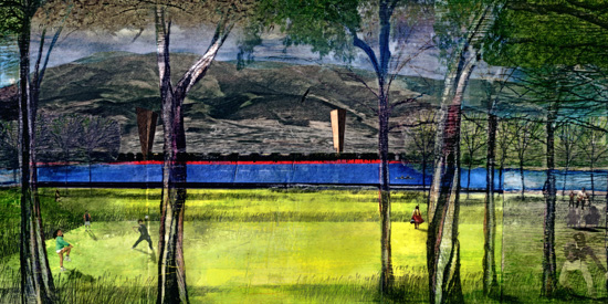
While desperately trying to organize our archives, we discovered an entry to an old ideas competition (whose website has since dissipated into the digital ether) for the transformation of Quito's international airport after its planned closing. It was designed by a trans-university team of professors and students from Arizona State University, the University of Illinois and Cal Poly. In the interest of disseminating ideas, especially good ones, we're reproducing their images below.
They're quite gorgeous, luscious even. A closer look reveals that some of the scale figures look as though they've been drawn by a deviant medieval monk dreamt up by Umberto Eco. There are fishermen with haloed cat heads, sheep-headed urban farmers also with halos, a goat-headed flâneur with a parasol; it's a menagerie of cryptids catalogued by Charles Avery during an altermodern journey to a magical realist landscape.
The designers weren't being silly, of course, because this graphic style was meant to convey a central concept. Ken McCown, one of the team members wrote, “We saw Ecuador as this country the UN recognizes with Megadiversity. With this megadiversity concept, we wanted to show that the people were intertwined with the landscape systems, and we linked this into the Catholic narrative of the saints into the pictures. So you have people that are part-human, part-animal performing the narratives of the saints while interacting with landscape processes. Religion/Humanities and Science together?”
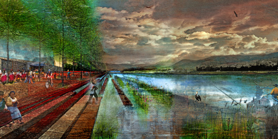
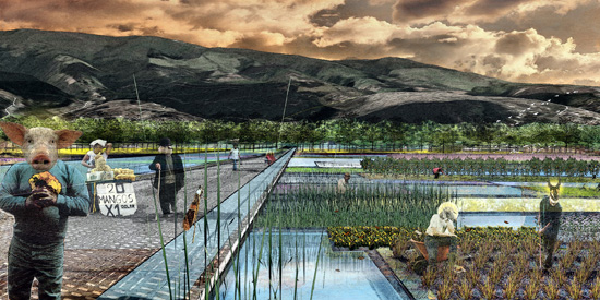
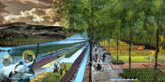
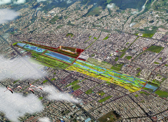
Quoting the project statement:
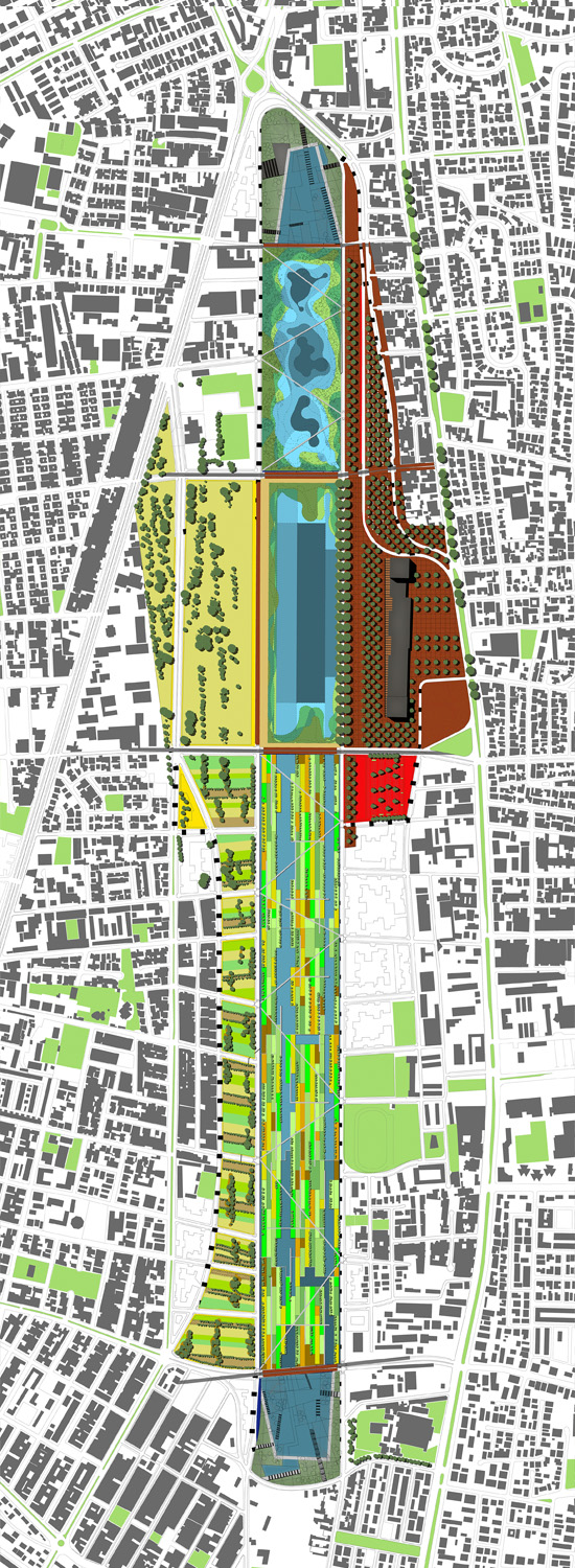
This design for the Parque del Lago in Quito, Ecuador celebrates the rebirth of Latin American culture as the last vestiges of colonialism wane in the early 21st century. It capitalizes on local conditions to grow a design suited to the needs of the city while celebrating Ecuador's status as a country of megadiversity. The Ecuadorian flag is the inspiration that organizes the design and provides a symbol for the capitol city. Three bands compose the reuse of the airport lands for a new urban park: agriculture, water, and market. These bands correspond to the colors of the flag, the yellow zone is agriculture and park use, the blue is water and the market area is the red zone.
We won't try to summarize the rest of it and instead will copy-paste it in full in the comments. For those that revel in project statements, it's a good read, recommended to our student readers. The entire proposal is quite pragmatic, not overly stylized or indulgently complicated. Their considered approach to restitch Quito's urban fabric is convincing. If the competition wasn't merely an ideas competition but actually was looking for something to build, it might have had a good chance at garnering the top prize and a commission.
Quito 1: Paisajes Emergentes